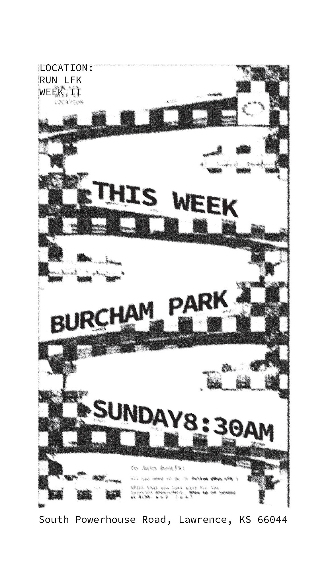
RUN LFK
Branding, Posters, Marketing
A run club started by me and my friends, branded and ran by me! This was one of my favorite and most rewarding projects! So fun to make and see my friends join in with!
When creating this logo and the brand I wanted to emphasize the "club" aspect, Community and being able to apply your own identity to the group.

The Logo is a run club of its own, circles form a simple, disc shaped logo that moves like a group of runners racing around a track one after the other.


The other brand elements include:
Orbs, organic, emphatic, circular but subtle.
Spacial type, that feels light and airy. Maintain legibality by using grouping and different lines to categorize information.
Outlined type and repetition to imply movement and energy.